I need your help…
I know I have mentioned this already, but I recently started a new internet shopping business and along with my business I would like to start a “Mel’s World Shopping Biz” blog. I have tried and tried to come up with a “look” that fits 1) me and my personality, 2) the concept of internet shopping, and 3) something that is, well…FUN and SASSY!
This is where YOU come in…I need your help! I have some of my favorite graphics listed below, but I just can’t seem to figure out which one best fits “Mel’s World Shopping Biz“.
Would you please take a few minutes and look at these and then leave a comment with the one you like the best?
I will pick one random winner out of all the comments and send them a $5 Starbuck’s gift card just for taking the time to help me out. You have until Tuesday, August 19th, to make a comment before I draw the winner at 5pm. Thanks a bunch…you guys ROCK!
Choice #1 – Excited Woman Shopping
Choice #2 – Woman with Shopping Bags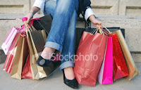
Choice #3 – Graphic of Woman Internet Shopping (Decisions)
 Choice #4 – Graphic of Woman Internet Shopping (Shoes)
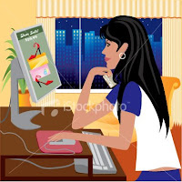
Choice #5 – Woman Shopping Online in Red Chair
Choice #6 – Young Girl Shopping online with Shopping Bags
 Ok, that’s it…I have my personal favorites, but I would absolutely LOVE to hear which one you like the best. Remember…it’s for my new blog, Mel’s World Shopping Biz, so your opinion counts! (Thanks Monkey Giggles for this great idea!!!)
Thanks a bunch…now, let the comments begin…~Melissa

I like #2. It gets the point across without showing a face, so it could be anyone!
I love the ‘idea’ of the last 3~ showing the integration of using the internet. But I dont LOVE those pics. They are missing something. Otherwise I too like the #2 for the same reason as Mari. Anne Marie tweeted about an incredible link with awesome resources for pics- http://skout.co.za/
Hit the Stock Photos columns. I saw some awesome pics! Its such a big decision- Its the Welcome Mat to your site! You will pick the right one! Its also hard not seeing the tone of the rest of your new blog.
Ok- You can see I am an over – analyzer!!!!!!!!
For me it was a toss up between #1 and #2, but I am going to pick…#1
I love her excitement, but I also agree with Mari – the anonymity of #2 is really good.
So, again, for me it is #1 – she is really excited to do some internet shopping at Mel’s World!
I like #1. Cause she looks hyper like me!
I like #3 because it specifically speaks to internet shopping and not just shopping in general.
I like #1
I like #6…for internet but I wish there was someone to take the person out…to leave it with no particular person …just internet and shopping bags…otherwise my first choice was #1 for enthusiasm but that’s just shopping…need to have Internet involved and I prefer real to graphics…without people…means no race, no gender…but it depends on your product!!!
Mel,
I like #2 and #3 the best, but they all are great.
Cheryl
I like #3 or #4 best… but for some reason I just don’t like the hair on #4. I don’t know if it is too black? It just looks funky to me. I agree on the thoughts of having the internet in the picture/logo. But I’m sure you’ll “spice it up a little” anyway before making it permanent.
I like #1 as my first choice and #2 as my 2nd choice.
Hugs!
Kat
I say #3 that would best fit your business.
Mel I love #1 something about her just reminds me of you lol!! She looks like she is soooo pumped! hope that helps!! Rob likes it too!
I like #2, but it doesn’t have anything to do with the internet, so then I thought #3. Hope that helps!
Your welcome
I like #3. 1&2 are cool but 3 has online reference and is way better than the others below it.
I like #1
I love #3 the best 🙂
I like #1 & #4, but really what do you like?? Thats what matters:)
I like #2, its like ton’s of shoping with none of the walking.